Buble
Data intelligence for founders who move fast.
Sharp thinking deserves a brand that looks like it.
Buble built a rigorous data intelligence practice from the ground up. Their methodology was tight, their client results were strong and their brand looked like every other early stage startup that had picked a font and called it a day. In a market where credibility is currency, looking generic is an expensive problem.
We mapped the data and research brand landscape to understand the category conventions and found almost universal sameness. Navy blue, clean sans serifs, abstract geometric icons. Every brand was signalling precision and trustworthiness in exactly the same way, which meant none of them were actually standing out. The companies winning the most interesting briefs weren't the ones that looked the most serious, they were the ones that looked the most confident.
What made Buble different was the human dimension of their work. They weren't selling raw data, they were selling interpretation, pattern recognition, the ability to find meaning in complexity. That became the strategic foundation: build a brand that feels alive and intelligent, not clinical and cold. Warm enough to be approachable, structured enough to be trusted.
Bold enough to be believed.
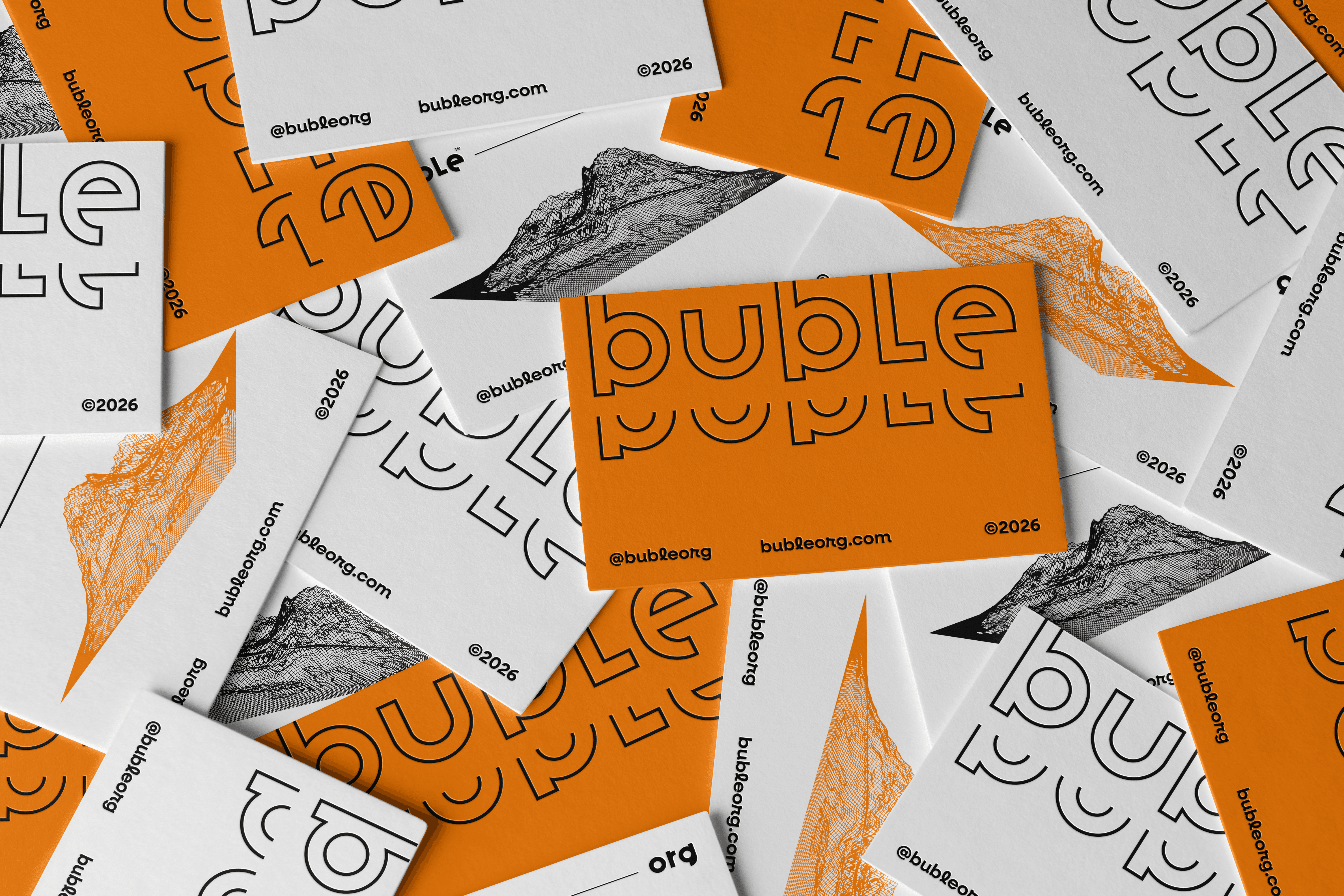
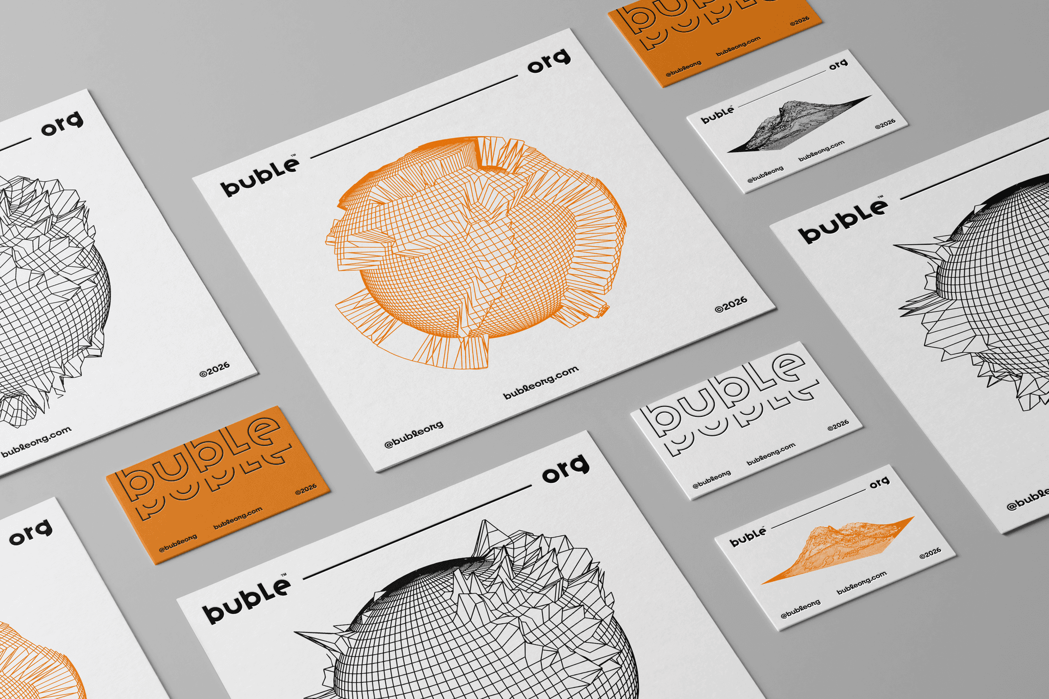
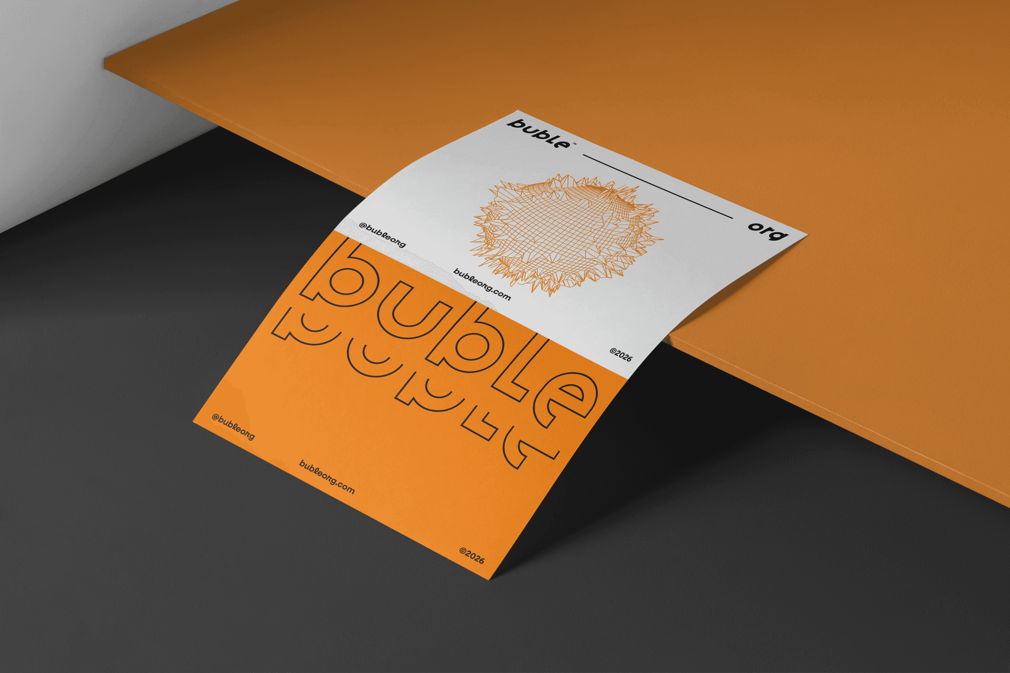
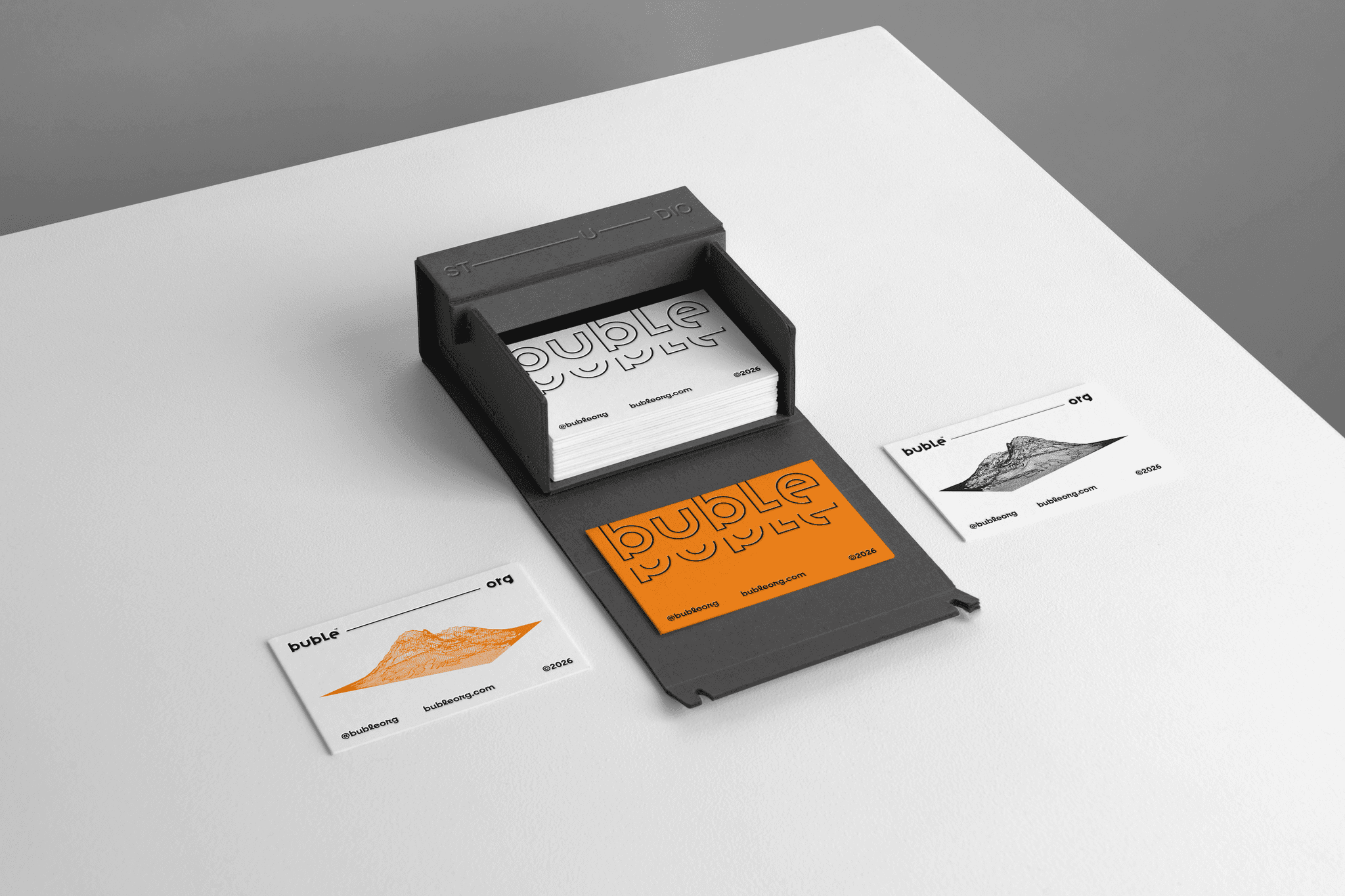
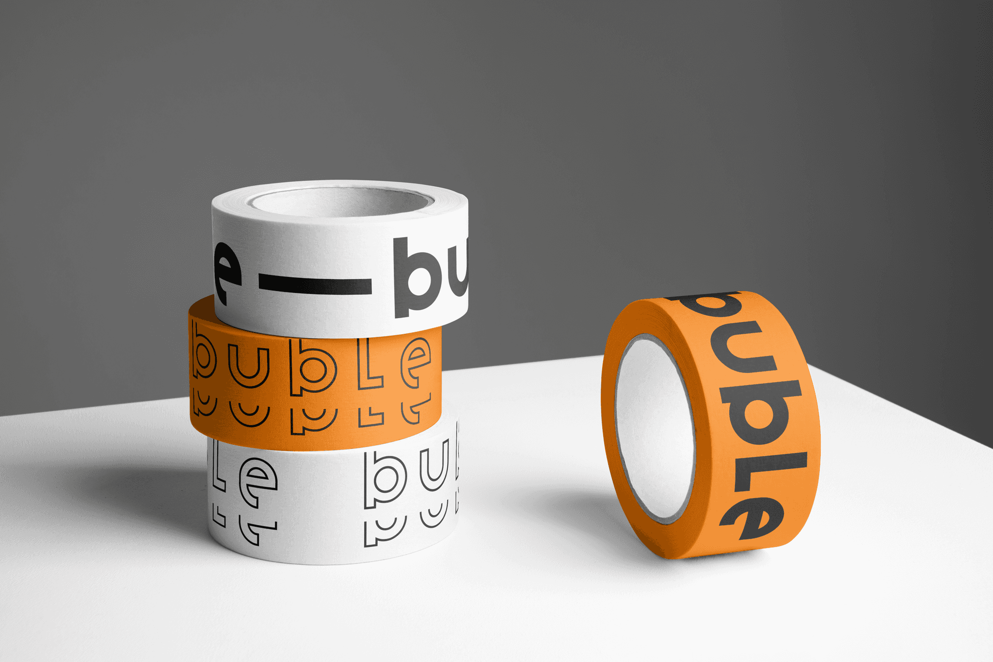
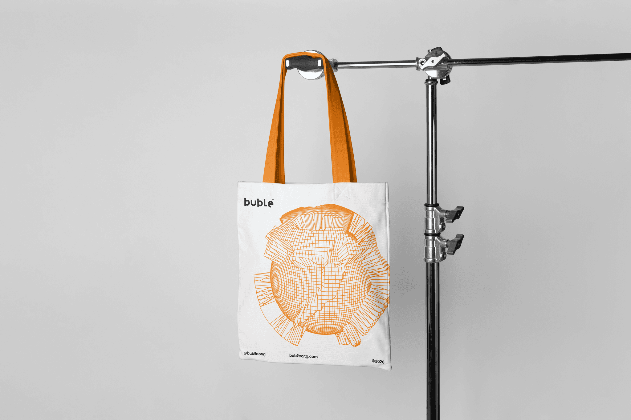
We built the identity around a vivid amber and white system, warm, energetic and deliberately unexpected for a research brand. The rounded logotype carries confidence without arrogance. The topographic line illustrations, contour maps, terrain cross sections, data made physical, run throughout the system as a visual metaphor for depth beneath the surface. They reference the act of finding structure in complexity, which is exactly what Buble does. The result is a brand that feels intelligent without feeling cold and distinctive enough to be remembered after a single business card.
Year
2026
Industry
Brand Identity
Scope
Visual Strategy, Logotype, and Brand Guidelines
Timeline
6 weeks
Year
2026
Industry
Brand Identity
Scope
Visual Strategy, Logotype, and Brand Guidelines
Timeline
6 weeks

Sharp thinking deserves a brand that looks like it.
Bold enough to be believed.
Buble built a rigorous data intelligence practice from the ground up. Their methodology was tight, their client results were strong and their brand looked like every other early stage startup that had picked a font and called it a day. In a market where credibility is currency, looking generic is an expensive problem.
We mapped the data and research brand landscape to understand the category conventions and found almost universal sameness. Navy blue, clean sans serifs, abstract geometric icons. Every brand was signalling precision and trustworthiness in exactly the same way, which meant none of them were actually standing out. The companies winning the most interesting briefs weren't the ones that looked the most serious, they were the ones that looked the most confident.
What made Buble different was the human dimension of their work. They weren't selling raw data, they were selling interpretation, pattern recognition, the ability to find meaning in complexity. That became the strategic foundation: build a brand that feels alive and intelligent, not clinical and cold. Warm enough to be approachable, structured enough to be trusted.
We built the identity around a vivid amber and white system, warm, energetic and deliberately unexpected for a research brand. The rounded logotype carries confidence without arrogance. The topographic line illustrations, contour maps, terrain cross sections, data made physical, run throughout the system as a visual metaphor for depth beneath the surface. They reference the act of finding structure in complexity, which is exactly what Buble does. The result is a brand that feels intelligent without feeling cold and distinctive enough to be remembered after a single business card.
Scope
Visual Strategy, Logotype, and Brand Guidelines
Timeline
6 weeks
Industry
Brand Identity
Year
2026