
MBOSS
High-end packaging, based in Vienna.
When the product is premium, the brand has to prove it first.
MBOSS builds high end packaging in Vienna. The craft was there from day one, the brand wasn't. Showing up to premium retail conversations with a generic visual identity was quietly costing them the positioning they had earned. Before a product is touched, the brand is already making a verdict. Theirs wasn't making the right one.
We started by auditing the premium packaging space across Europe, studying how the category's leading names communicated quality visually. The pattern was clear: the brands that commanded the highest perceived value said the least. No gradients, no decoration, no noise. Authority came from restraint. What was also clear was that almost every competitor was leaning on material photography to do the heavy lifting, the brand identity itself was an afterthought. That was the white space.
The strategic decision was to build an identity so considered that it could carry the brand without a single product image in the frame. Structure over style. Geometry over decoration. A system that communicated precision before anything was unboxed.
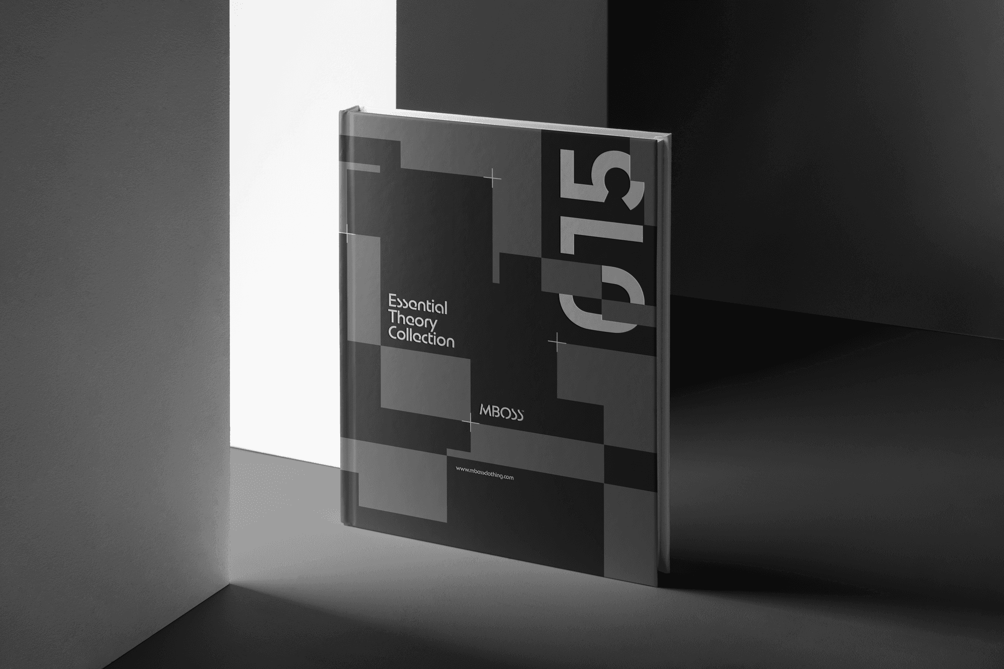
Precision as a design language.
The entire system is built on a geometric grid, concentric squares, modular patterns, a logotype engineered to look cut rather than drawn. The palette is near black and white only. Texture does the work that colour never needs to. Every application, packaging, tags, tote bags, signage, was designed to read as a single coherent statement. Not a brand that supports the product. A brand that is as considered as the product itself.
Year
2024
Industry
Brand Identity
Scope
Visual Strategy, Logotype, and Design System
Timeline
3 months
Year
2024
Industry
Brand Identity
Scope
Visual Strategy, Logotype, and Design System
Timeline
3 months


When the product is premium, the brand has to prove it first.
Precision as a design language.
MBOSS builds high end packaging in Vienna. The craft was there from day one, the brand wasn't. Showing up to premium retail conversations with a generic visual identity was quietly costing them the positioning they had earned. Before a product is touched, the brand is already making a verdict. Theirs wasn't making the right one.
We started by auditing the premium packaging space across Europe, studying how the category's leading names communicated quality visually. The pattern was clear: the brands that commanded the highest perceived value said the least. No gradients, no decoration, no noise. Authority came from restraint. What was also clear was that almost every competitor was leaning on material photography to do the heavy lifting, the brand identity itself was an afterthought. That was the white space.
The strategic decision was to build an identity so considered that it could carry the brand without a single product image in the frame. Structure over style. Geometry over decoration. A system that communicated precision before anything was unboxed.
The entire system is built on a geometric grid, concentric squares, modular patterns, a logotype engineered to look cut rather than drawn. The palette is near black and white only. Texture does the work that colour never needs to. Every application, packaging, tags, tote bags, signage, was designed to read as a single coherent statement. Not a brand that supports the product. A brand that is as considered as the product itself.
Scope
Visual Strategy, Logotype, and Design System
Timeline
3 months
Industry
Brand Identity
Year
2024